Four albums top my all-time favorite records list. They’re some of my favorite albums musically, but their impact and significance to me and other listeners run deeper than that. After spending so many cumulative hours engaging deeply with these works, I realized that these four great covers can teach us everything we need to know about what makes truly outstanding album artwork.
Let’s look at them individually first.

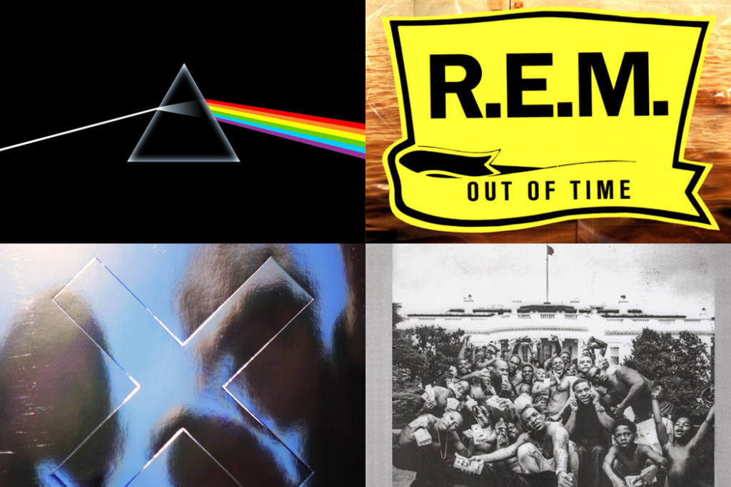
The simplicity of the cover art complements the simplicity of the transitions between songs. I always have a general feeling of floating in space when listening to this record, first imprinted on me by the open dimensions of the cover artwork. I also always have a general feeling of forward movement and approaching a better time and clearer mind, as if I’ve started on the single left strand of white light and ended up on the right rainbow side of the prism.
All of Pink Floyd’s other covers are somewhat bizarre images, made up of abstract ideas and concepts, but this one is simple and scientific. So I think this helps ground the music and allows the listener to focus on its intentionality.
Although the album is called Out of Time, this laid-back cover doesn’t display too much urgency, and that feeling permeates through my listening experience. The color palette gives off a country feel; the road-sign yellow makes it almost feel like it’s supposed to ramble on and on, yet these classic songs fall under the umbrella of alternative rock. There’s something simple yet stoic about this album cover that mimics the music on the record inside.

There’s a screen between the band and me, which is how I feel during the beginning notes of the album’s first track, “Dangerous,” but it’s broken down by the end of the song. All of The xx’s studio albums feature that iconic “X,” but this is the first time the band members appear on the cover themselves, albeit blurred out and in shadow. It’s like they’re slowly becoming more personal; we’re getting to know each other more.
You can see that the band is looking at us here as well — “I see you.” The album was made for you, the listener, and no one else.

This monumental album sets out to use drama and personal storytelling to question the government, retell the history of oppression in America, and present potent contemporary slices of life through a bit of hyperbole. Its cover displays all of that metaphorically with its depiction of youth culture outside the White House conquering a judge.
There’s chaos in this photo, but the crowd is the real winner here, triumphing on the cover, in life, and at the end of the album, which features a crowd of people. The artwork has always led me to imagine the audio is from the same group appearing on the cover.
+ Read more on Flypaper: How are The xx, Björk, Massive Attack, and other artists pioneering the musical mobile app space?
Despite how different each of these albums is musically, and how different these covers are artistically, they all oddly enough have something in common: the album covers have distinctly shaped my listening experience.
While creating album art as a band or for a band, it’s important to remember that, no matter your intention, this artwork is surely going to shape the listener’s relationship with the music. It might only be initially, but this impression could also last forever in some people. The point is, you don’t really know.
The album artwork is like the last advertisement for the album, luring in both target audiences and curious passers-by. All it needs to do is set a tone. And there are a few avenues for this:
- Someone might buy your album solely based on its cover (even though we’ve been told not to judge a book by its…).
- A fan of your band will anticipate the new record based on its cover compared with your other albums.
- A truly invested fan will try to track a narrative between this and previous album covers.
- If someone recommends your album to a friend, the cover may shape that person’s first listen.
Minimalize It!
One thing that these four album covers all have in common is their awesome minimalistic approach. Although To Pimp a Butterfly has many tiny details incorporated into it, and they all probably have stories behind them, there isn’t a lot of visual information to process any of them.
For the most part, the color schemes are also pretty tight. All four of these albums give listeners a good sense of what the corresponding music will sound like without overwhelming them with confusion. Minimal design leaves the listener’s initial impressions open-ended and allows one to find their place within the music much easier.
+ Learn more on Soundfly: Create more powerful emotional experiences in your music by understanding harmonic theory. Our brand-new, mentor-driven course, Unlocking the Emotional Power of Chords, can help you get there quicker!
Be Mindful of the Message
If the messaging is too important to be left to chance, in the case of minimal design, then spend some extra effort crafting something that will give a crystal clear impression of the music on impact. As I mention above, your album art will set the tone for the entire listen of the album. Sometimes, it’s unclear what the songs are really about, so the cover artwork is a great opportunity to give listeners a glimpse into its inspiration. It can also be a good chance to throw listeners off.
Whatever the ideal first reaction to your album is that you’d like to craft, this is the place to display it.
But don’t be too literal. Displaying the title literally on the cover through imagery could actually cause distraction from intended messages. Imagine if The xx’s I See You was the three band members looking directly at the camera? It’d be super awkward and uncharacteristic! Or if R.E.M.’s cover featured a clock, or if Floyd’s featured a moon, or if Lamar’s featured… well, we don’t have to go there.
+ Read more on Flypaper: “Why ‘Sympathy for the Devil’ Should Never Have Been a Hit”
Originality is Key
Of course, all artistic style derives from somewhere. References are interesting and reveal depth, but it’s important to display original content on your album. The cover is not the place where you want to rip somebody off.
Not only is this linked to the message you’re sending about your album, but it also shows audiences your true thoughts about the work you just created. Did your album take a lot of time to finish? Most likely. Your artwork is the icing on the cake to show your listeners just how much effort went into creating this album. If you end up with a “copy and pasted” album cover, audiences will be skeptical of how much of your work is unoriginal.
Even if your design’s origins come from somewhere else, if the imagery means something personal to you or comes out of the same thoughtful place as the music, it will land well.
Know Your Designer
The best decision I ever made while creating album artwork was to ask my designer friends to take a stab at it. They knew the place that my music was coming from because they had experienced many of the situations and much of the context I was writing about.
This isn’t to say that you should only consult your friends for designs, but you should be familiar with your designer beyond a brief introduction. Know that person’s work and have a reason for choosing him or her to create your art. Tell him or her why you like his or her designs in particular, what speaks to you, and what that person can emphasize in his or her work for you. For example, the creative director for my band asked me to send her pictures that I liked before she designed my logo and EP cover.
The more your designer knows, the better he or she can prepare your album for outside listeners. Remember, this artwork can offer listeners a chance to peek inside the back door of your motivation for creating the album.
—
Even though this might all sound super intimidating, especially to an emerging musician or artist home recording their first record, you’ll know when your album art works. Don’t settle on something that’s simply fine. Keep on pushing until your album art displays exactly what you want it to and shapes even your own future listens of your album.
Got album cover favorites of your own and want to share them? Post them in the comments!