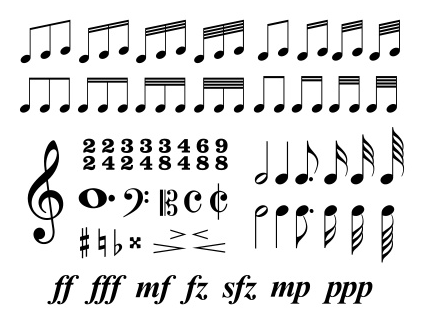
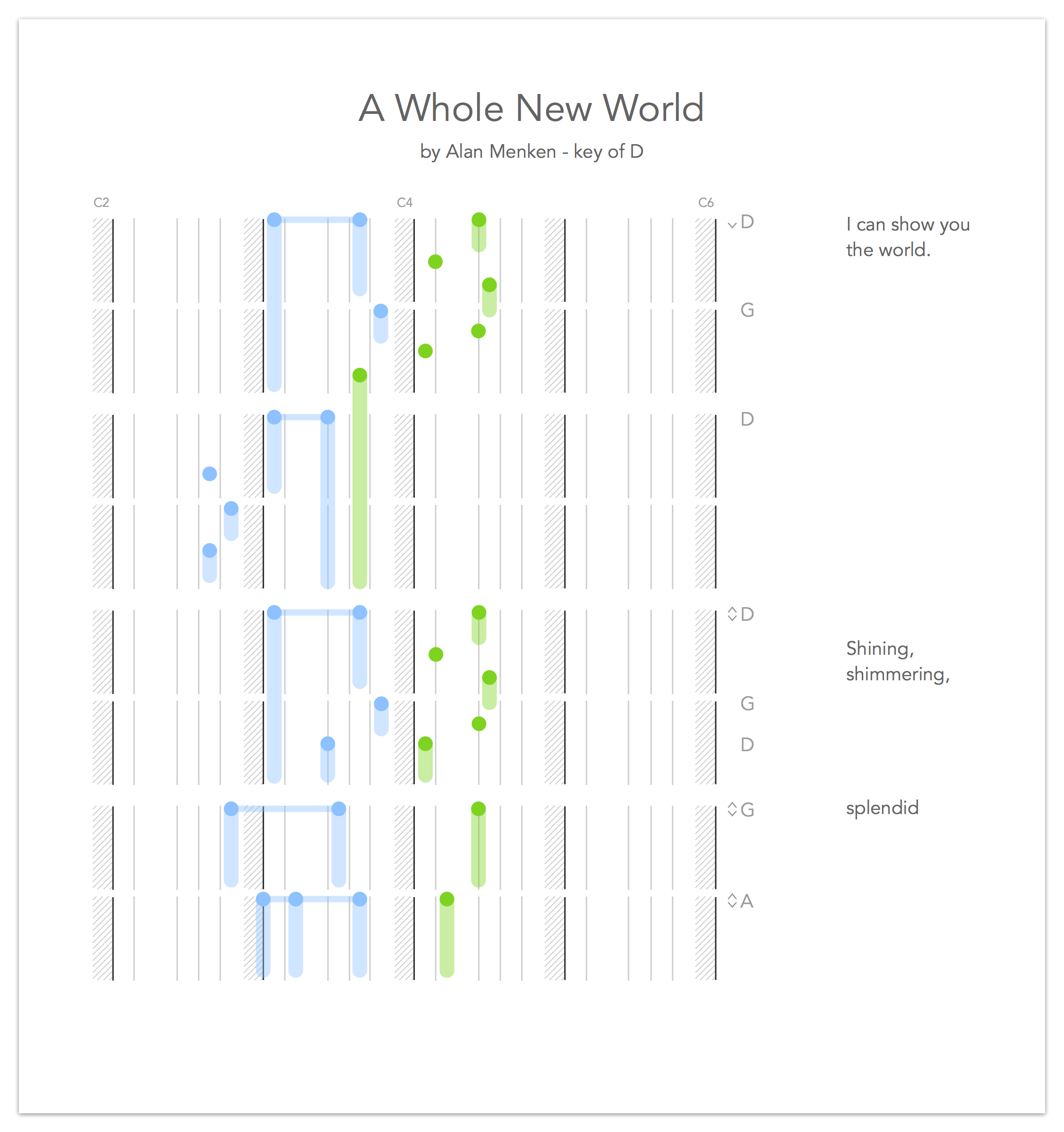
TL;DR: Here’s a new method for writing sheet music for piano that makes it easier to learn to play everyday songs. Traditional sheet music relies on symbols, scales and memorization and can be difficult to learn and read, so this new notation uses visual cues by showing “fingers and hands” on keys. It’s read from top to bottom with each circle being a finger placement (blue is the left hand, green is right) with the trailing colors showing how long you hold the notes. The gray lines are the black keys and the spaces between are the white keys, plus the C keys are shaded for easier navigation.
The Challenge
Reading traditional sheet music can be difficult. Many people, like professional musicians and dedicated hobbyists, put in considerable time and effort to learn how to read it. Most people don’t.
Guitar players who don’t read sheet music can lean on guitar tablature as a learning tool, but a piano player’s alternatives are limited to learning by ear or from basic chords. Chords are simple, but sheet music is advanced. I’m trying to find the middle ground.
About This Project
This is a personal project where I’m trying to A) solve a problem, B) get a conversation started, and C) have fun thinking about a hobby I love. I’m addressing the casual piano player, one who wants to learn how to play songs well but doesn’t have the time or attention to learn from traditional sheet music. This target user is probably learning easy, contemporary songs, and already knows what they sound like before they learn them. Maybe they’d even like to sing over the music!
What this project is not:
- A professional project: There’s no “real user research” here, just a designer, some crayons, and friends willing to give feedback.
- Exact visual forms and shapes: I’ve used basic shapes and formats. These are simply mockups intended to demonstrate a concept.
- An attempt to “replace” traditional sheet music: Sheet music has been around for over 500 years (thanks, Wikipedia), and it’s amazing! A professional instrumentalist can sit down in front of any piece of sheet music and play it, even if they’d never heard it before. That notation is flexible, precise, and has stood the test of time. But, as I mentioned, there’s a hefty learning curve. My new notation is for new audiences, not for those already proficient with traditional sheet music.
So here’s what I came up with…
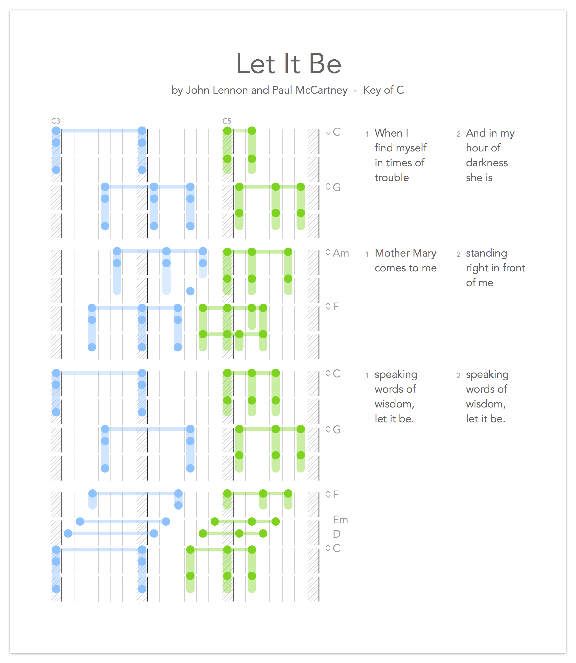
Overall Form
It looks like a keyboard, doesn’t it? Recognizability is critical here, that the student sees a note on the sheet and can associate that with a physical location (a key). The challenge with this approach minimizing the amount of visual noise, so I chose to use thin lines to represent black keys and the adjacent negative space represent white keys.
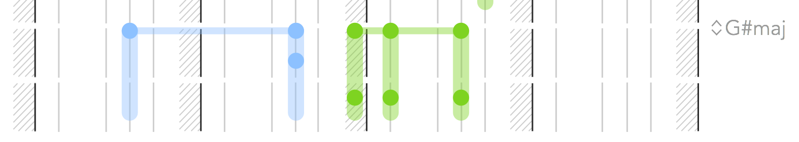
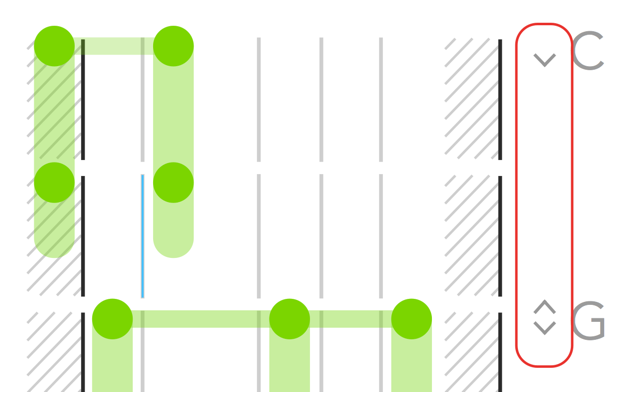
After trying a few versions, I ended up shading in the C notes as “anchors,” as C is a common “home base” for beginners. This neatly divides up the octaves, as well. Because I already use shading in the chords, I gave these anchors a thatched shading (diagonal lines). This allows chords to overlap the C notes while maintaining clear meaning for both. Here’s an example:
A more “interactive” version of this notation could move the shading depending on what key the song is in — i.e., a song in “F” would have each F key shaded — but for the sake of printability and consistency, I stuck with C. Plus, some songs do change keys midway through, so leaving Cs shaded at all times avoids that complication.
Measures and timing: I took a cue here from Stephen Few’s work on data visualization. Blank space can be a very effective means to separate visual elements. So, instead of dividing up beats and measures with lines (similar to traditional sheet music), I used white space.
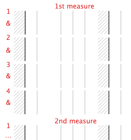
The narrow spaces represent “down” beats, which I’ve noted in the picture above. I think this is a succinct and sufficient system for this project, but there are two notable shortcomings:
- Precision: Because I’m not using exact symbols and signs, where the notes fall is a bit open to interpretation. It’ll take having a “feel” for the song. But for learnability, it’s a worthwhile sacrifice.
- Uncommon time signatures: This default state is based on four beats per measure, i.e., a “4/4” time signature, so it would need to be customized to fit a 3/4, 6/4, 7/4, or any number of less common time signatures. For most contemporary music, this default 4/4 should be fine, but others will require custom printing.
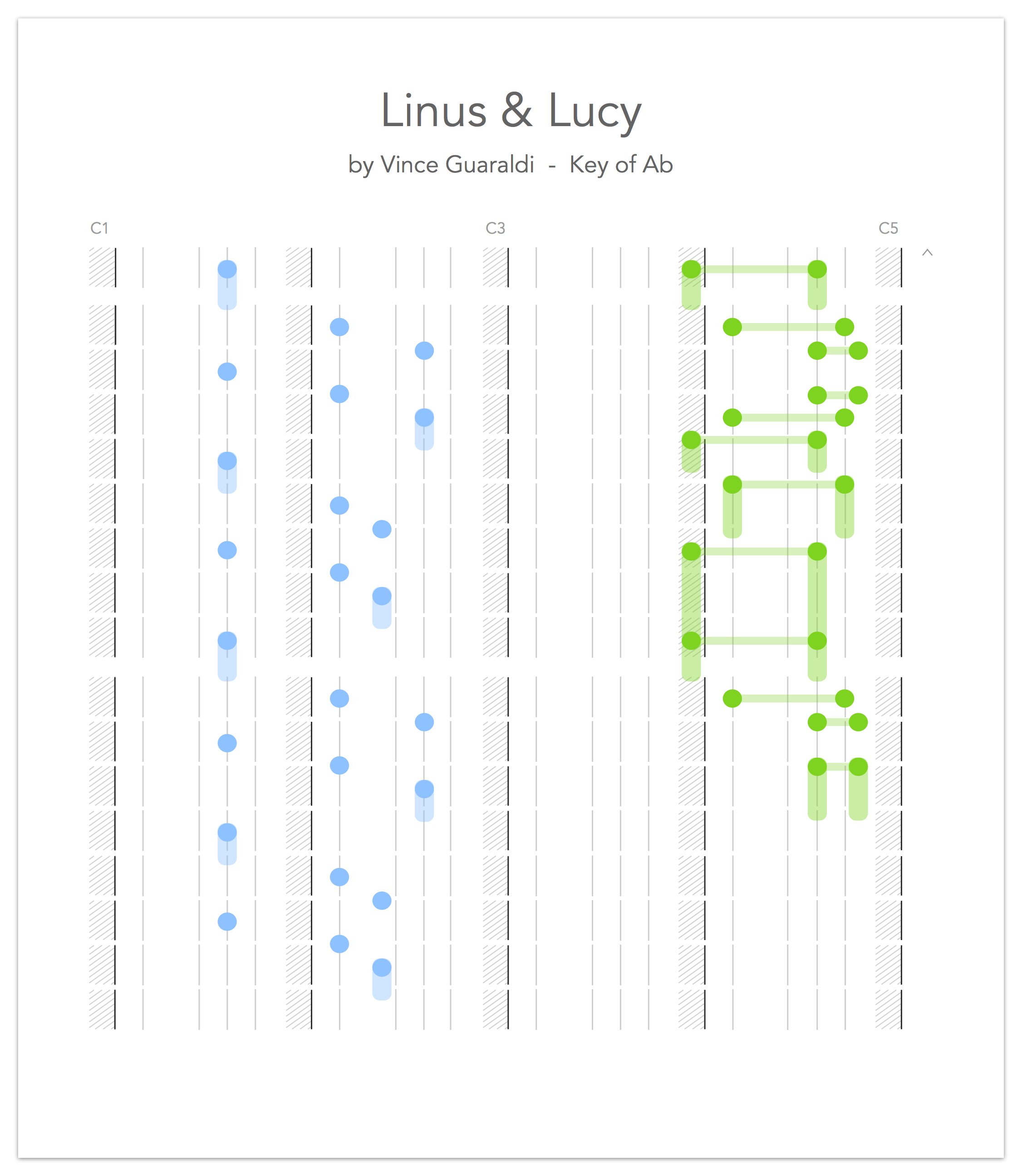
Below, I’ve notated the first few measures of Vince Guaraldi’s “Linus and Lucy” (aka, the Peanuts theme song) using a different time signature that has eight beats per measure:
Lastly, there are two additional advantages in the overall format used here:
- It’s easily printable. Without the notes and chords, this is just a lightweight, black-and-white printout.
- It’s screen- and scroll-friendly. On a tablet or laptop, the top-to-bottom orientation works well with scrolling. If read on a digital device like this, it eliminates the need for page-turning or pages at all.
Chords and Notes
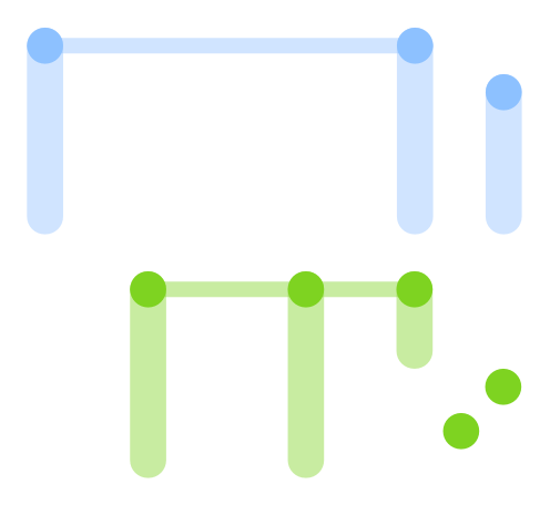
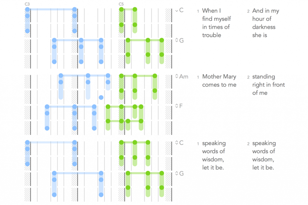
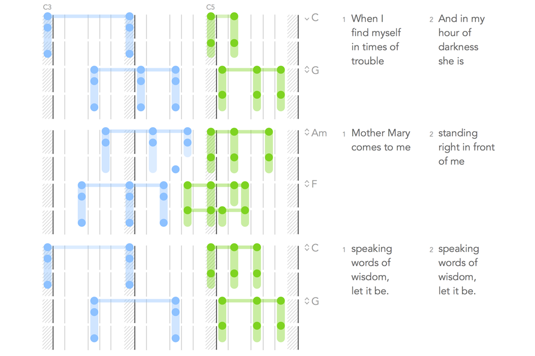
Overview: After a few iterations, I arrived at this upside-down-trident shape. The dark circles represent fingers hitting piano keys — they can stand alone or as part of a chord. The lighter, transparent, vertical bars represent held notes when your fingers stay on the key(s) after the initial hit. The lighter horizontal bar simply connects the notes in a chord (traditional sheet music does something similar). I made the horizontal “chord” lines thinner than the vertical “hold” lines to differentiate the meanings and to minimize visual weight on the page.
Colors: Different colors represent a player’s left hand (blue) versus right (green). It breaks up the content and helps the player understand which hand is doing what. However, this would still work for colorblind users (and on black/white printers and handwritten), as the overall meaning persists even without color.
As for color selection: They’re light, cool colors for easy viewing… I’m sure a focused, visual designer, with some research and testing, could come up with an optimal color combination for contrast and recognition.
Circles: For “hits,” I started with circles as a nod to traditional sheet music. But after testing a few other shapes (e.g., upside-down triangles, oblique ovals, and X’s), circles maintain advantages: They’re easy to draw by hand, they’re the basic shape of a fingertip, and (even more than oblique ovals) they can be placed immediately adjacent to each other in a chord without losing meaning or crowding the area. See below.
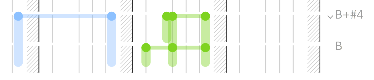
The rest of the chord shapes accommodate the circle. One disadvantage is that shades are hard to draw by hand, so you can see below that I use “squiggly lines” for shorthand:
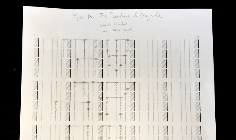
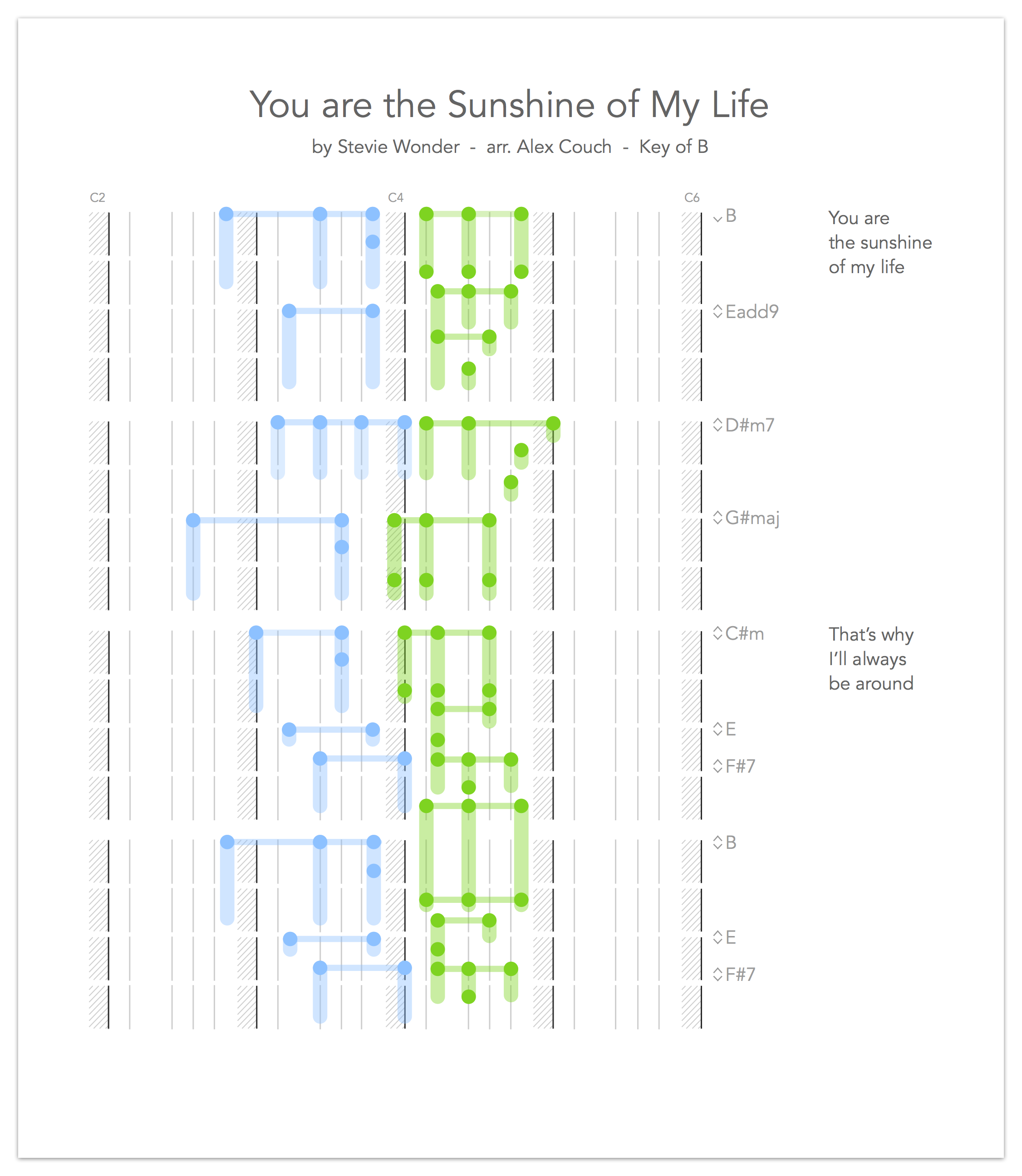
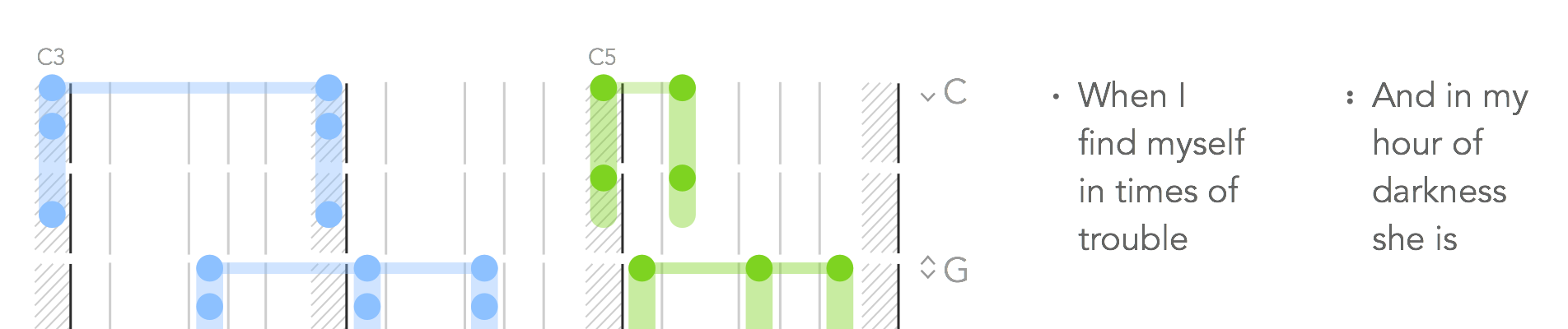
Below is the digitalized version of the above, that is, the first few measures of “You Are the Sunshine of My Life,” by Stevie Wonder. This song shows what this notation looks like for a more complex song that uses black keys.
Other Items on the Sheet
Chord names: the grey letters on the right side show the name of each chord. It’s unclear how well the intended audience knows chord names, so this is more of an optional item. Those who know chord names can use them. For those still learning chords, this combination could be a great learning tool. I’ve put the “simple” chord names here, instead of specifically noting any inversions or additional nuance.
The small grey letters on the top are not chords; those indicate the corresponding C keys on an 88-key piano (e.g., C2 is the 2nd “C” note on a piano). This assists in learning and places the song in the correct octave.
Lyrics: This notation could stand alone or with lyrics spelled out to the side. For contemporary songs, lyrics should help a player navigate the music.
For songs with repeated parts, you could save some space and stack multiple verses side by side; you can see this above. I’ve used numbers to indicate verses (as a player’s eyes would be darting back and forth between the chords and lyrics). A challenge is that multiple verses take up horizontal space, so I’ve had to cut the number of octaves shown; songs with wider octave spreads wouldn’t necessarily be able to accommodate this.
I initially tried to match the lyrics more closely with the notes being played, breaking it up almost word for word, but the result was messy, so I grouped the lyrics per measure. It’s easier to read, and players should be able to figure it out.
Foot pedal arrows: The foot pedal (aka, the “sustain pedal”) control is something I struggled with. For me, the foot pedal is an afterthought… something that you hold down until things sound too messy, then you lift and press again. (My childhood piano teacher would kill me for saying that.)
I considered using a foot pedal indicator on the left side, but it would have competed for attention (on the opposite side of the page, to boot). I also considered incorporating it with the chords (say, an up or down arrow or edge on the notes to indicate pedal motion), but foot pedal action isn’t always associated with a new chord.
So I ended up with the up/down arrows, to demonstrate when a foot is lifted (up), and when it’s pressed (down). This is most often associated with chords, but we could use standalone arrows where appropriate.
Conclusion
So that’s it: my take on what “piano tablature music” should look like. Where traditional music is read like a second language (and is notably beautiful when “spoken” well), this should read more like an instruction manual: appropriate for beginners and intermediate players trying to play contemporary music. The learning curve is intended to be shallow enough to invite more piano players to learn and play.
If you’ve made it through this (long) piece, thanks for the time! Please recommend this piece and leave your comments… feedback is welcome. For direct contact, reach out to me at couch.ux [at] gmail [dot] com.
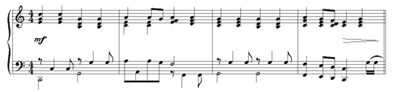
PS: Just for fun, let’s look at one more piece: This shows what a more complicated bass line looks like and demonstrates how a melody can be notated even when the player isn’t singing it. It also shows a different time signature, two beats per measure.
PPS: Your feedback has been heard! I’ve responded to your collective feedback in this article.
Explore Soundfly’s growing array of Mainstage courses that feature personal support and mentorship from experienced professionals in the field, such as Beat Making in Ableton Live, Orchestration for Strings, Unlocking the Emotional Power of Chords, and Faders Up: Modern Mixing Techniques.
© Alex Couch, 2015. Unauthorized use and/or duplication of this material without express and written permission from this site’s author and/or owner is strictly prohibited. Excerpts and links may be used, provided that full and clear credit is given to Alex Couch with appropriate and specific direction to the original content.
—
 Alex Couch is a Product Designer in San Francisco. Music fan, pizza eater, Medium reader.